Big difference in the way it looks and feels (us nerd folk call it GUI, or graphic user interface), right?
Everything has come very basic, clean, simplified, an pictogram like. I'm expecting a sign to point us to the women's and men's bathrooms on the Windows Start Screen.


Gone are the faux leather, brushed aluminum surfaces, and glossy glass embossed buttons and heavy drop shadows. The design historian in me automatically thinks of the signage for the 1972 Munich Olympics, right down to the bright primary colors (that some critics are calling Fisher Price/Playskool-esque). Then, elegant san-serif type is used.

This is what people are calling "Flat Design" a newish trend (or philosophy depending on who you talk to). It's also been called "honest design"
"Instead, flat advocates (flatvocates?) argue that GUIs—graphical user interfaces—should eschew style for functionality. That means getting rid of beveled edges, gradients, shadows, and reflections, as well as creating a user experience that plays to the strengths of digital interfaces, rather than limiting the user to the confines of the familiar analog world. In web design as well, "flat" pages rarely introduce dimensionality, shadows, or textures into the equation, relying instead on parallax scrolling and visual clarity to communicate."
http://gizmodo.com/what-is-flat-design-508963228

People work well with metaphors and what's familiar to them. Electronics/music players are metal like iTunes interface. Our address books of the past were leather bound, so why not make it look like a leather bound book. Even the file folders on our computer often look like the manila paper file folders we use in the office. The recycle bin/trash looks like an actual trash can.
Us fancy pants people call this skeumorphism.. computer/digital interfaces looking like real life objects and surfaces. According to Wikipedia " "a physical ornament or design on an object made to resemble another material or technique"
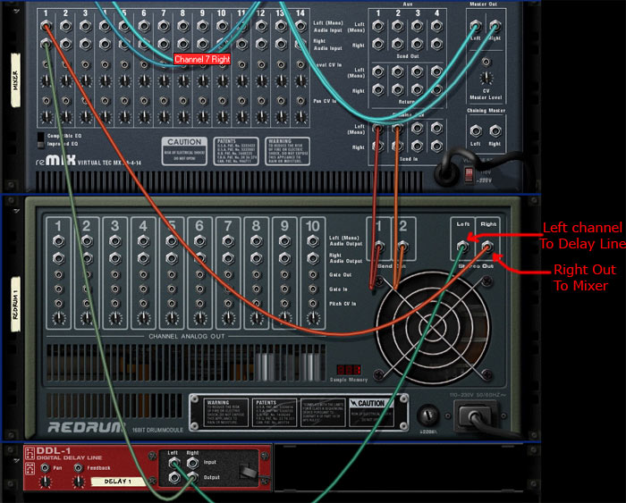
Probably the most "skeumorphic" program I can think of is the music making software program Reason, by Propellerheads. It's purposely made to look like an actual rack of music gear. So much to the fact that you can flip the rack around and using virtual patch chords and rewire the virtual gear.

Some compare Flat Design to the Bauhaus and Swiss International Style reaction to the overly ornamental and decorative styles of the Victorian era.
And since my own design education we had the Swiss style beat into us, I like Flat Design quite a bit.


But its obviously not so simple. As a musician who does use Propellerhead's Reason, I love the fact that it looks like virtual gear. I also like the virtual cabling in the back. I think if I actually could afford some real music gear I would understand now how to hook up audio gear like reverbs and compressors together.
So like most things, it's a bit of a compromise. I think use Flat Design where it makes sense. The virtual dissection of a "flat frog" for a science class seems pretty silly, but on interfaces like Windows8 (which functional/features problems to me are for more troubling than how it looks) and iOS7. it will be interesting to see.
But if EVERYTHING goes flat in two or three years the web is going to look very boring.
I worry when a visual style develops a manifesto. The Flat Design movement has had an air of fanaticism about it that sticks in my craw, and while I have had the same Swiss/Bauhaus design background that you have, my take-away was that a lot of designers from that movement (speaking primarily of architecture, to be fair) had an elitist disdain for the sensibilities of people who would have to live with their designs. There is a threat of that in standardizing abstract approaches to usability in the common systems that office workers and grandparents will have to use. Maybe the Flat Apocalypse can be avoided. I just don't trust designers (myself included) to pass up novelty and high concept when it's available, and I think a lot of users will suffer for it.
ReplyDeleteThis comment has been removed by the author.
Deletei personally prefer the concepts like the Aero-glass that Win7 had.
ReplyDeletedepth and dimension afforded by a little extra flourish reminds me that I am in fact dealing with an icon on my screen and the fact that i have a background image instead of a single color goes farther to make my desktop interesting.
i have always had the choice to go flat. give me the choice back or gtfo and be prepared to deal with it if i don't upgrade my OS because i don't want my computer screen to look like i bought a damned Xbox.
(i don't give a crap what Apple does... i don't buy their over priced and under powered garbage anyway.)
"Flat" design in my opinion is just a designer's self-indulgence. There is no reason anywhere as to why a g.u.i. should be entirely "flat" (i.e. without any shadows or volume). Plus, these layouts generally make interactive areas (like buttons) less visible, because they're on the same visual level as everything else. That is not a good thing.
ReplyDeleteI could go on about Apple's many design faux pas that happened just because a designer (Jonathan Ive maybe) had a neat idea he was in love with. Like the round mouse of the first iMacs back in 1999. Apple did produce them for more than a year even though these mice's functionality was fundamentally flawed.
So no, I don't look up at Apple as the Source of Infaillible Design Perfection.
Respect your users first, always.
++Rico
http://btd-studio.com
Im not sure why everyone is faulting Apple with this trend when Google and Microsoft rolled it out first.
DeleteDo you feel the Bauhaus were too self indulgent with their minimalist ideas as mentioned in the post?
Even this website isn't completely 'flat'...note the subtle shading at the edge of the 'page'? Far more interesting than flat design! The thing is not to take skeumorphism to excess -- and to use sensible visual metaphors (a cassette tape for a recordign programme would never do)!
ReplyDelete